A closer look at the thinking behind our redesigned experience on WhatsApp Every day, WhatsApp plays a vital role in how over 2 billion people connect. With that kind of reach comes real responsibility — and we don’t take that lightly. We obsess over the little things, aiming to deliver a product that not only functions effortlessly but also feels like a natural extension of your device. The goal? To help you stay present in the conversations that truly matter. When our design supports more meaningful communication and unlocks new ways to connect, we know we’re doing something right. Our design approach is rooted in WhatsApp’s core values: simplicity, dependability, and privacy. We interpret these principles through a design lens, crafting clear, intuitive experiences that are universally accessible. Every flow is built with intention — to make connecting feel easy while safeguarding your privacy. We’re thoughtful about how people already use their phones and shape the interface to align with those patterns, so WhatsApp feels familiar from the first tap. If you’re comfortable using your phone, you’ll feel right at home here.
YEAR
2024
ROLE
Lead Product Designer
SERVICES
Product Design
Design systems
Illustrations
Motion
About the project
Reimagining the App Experience
The way we approach change at WhatsApp is deliberate — it’s rooted in empathy, and always considers the human impact first. Every design decision is made with care, taking into account varying internet speeds, levels of digital fluency, and how people build habits through repetition. We’re thoughtful about preserving what’s familiar, so updates feel smooth and purposeful rather than disruptive.
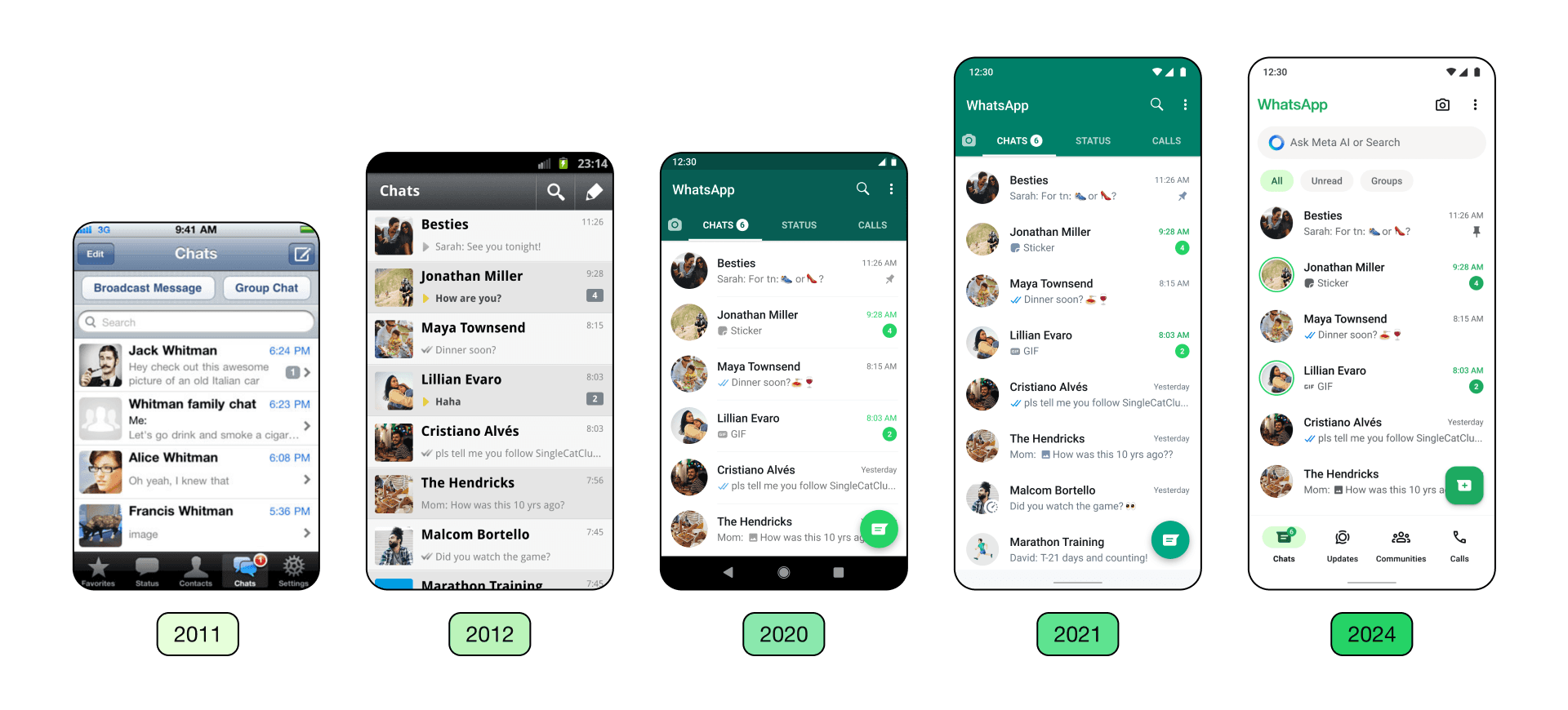
In the past, much of our focus has been on increasing functionality. As WhatsApp’s capabilities expanded, we recognized the need for the visual design to evolve alongside it. Our goal was to modernize the interface — keeping the core feel intact, while introducing a cleaner, more updated aesthetic.
Design foundations that guided our work
To navigate the many rounds of exploration, iteration, and discussion, our team anchored on three core principles:
Fresh: WhatsApp should feel modern, fun, and personally yours — while maintaining a design that’s native to the device you use.
Approachable: Using WhatsApp should feel natural and welcoming. The interface should blend seamlessly with your OS while retaining that familiar WhatsApp personality — casual, friendly, a little bit playful.
Simple: Any updates to design should reinforce clarity, work at scale, and support future product growth.
A refreshed color system
We introduced a more cohesive green palette that brings consistency throughout the app. After exploring over 35 options, we refined a collection of hues that stay true to WhatsApp’s signature green while providing better harmony across different surfaces. Alongside that, we expanded the use of neutral tones, allowing us to highlight key elements with green more intentionally.

We also responded to requests for a deeper dark mode. The updated version features a darker shade with increased contrast — making it more comfortable to view in dim lighting and easier to read.

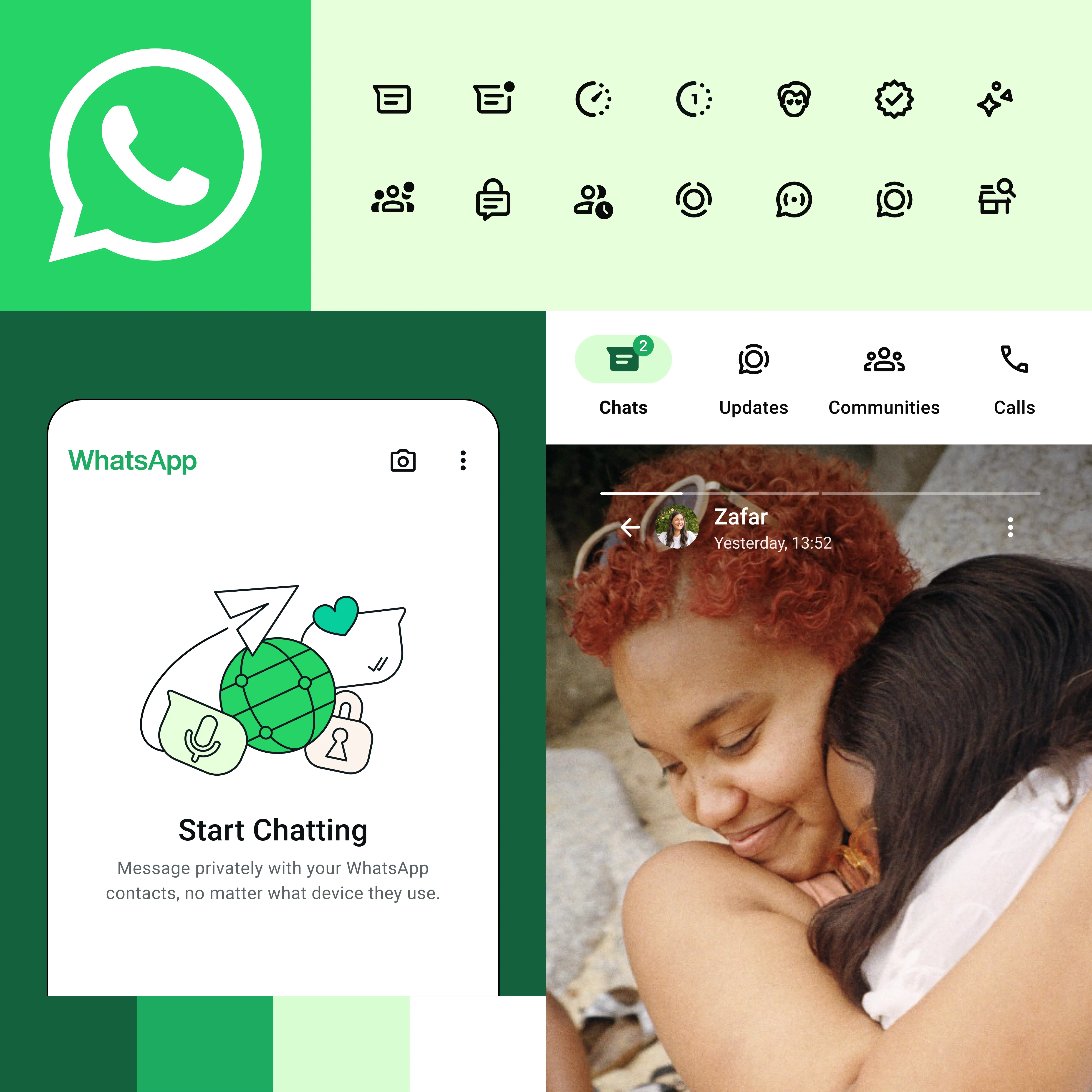
Updated visuals and playful animation
Visual cues like icons help guide people quickly through actions and information, so we focused on making them more intuitive. Our icons now feature rounded outlines for a cleaner, friendlier look. We also updated our illustration style to match — with new animations that add warmth and a touch of playfulness to the experience.

We took this opportunity to revisit the default chat background, too. The doodle was beloved by many, but we saw a chance to make it feel more connected to real conversations. We re-evaluated every element in the illustration and introduced a new set of simple, inclusive visuals that reflect a broader range of people and everyday symbols.

Navigation that’s easier to reach
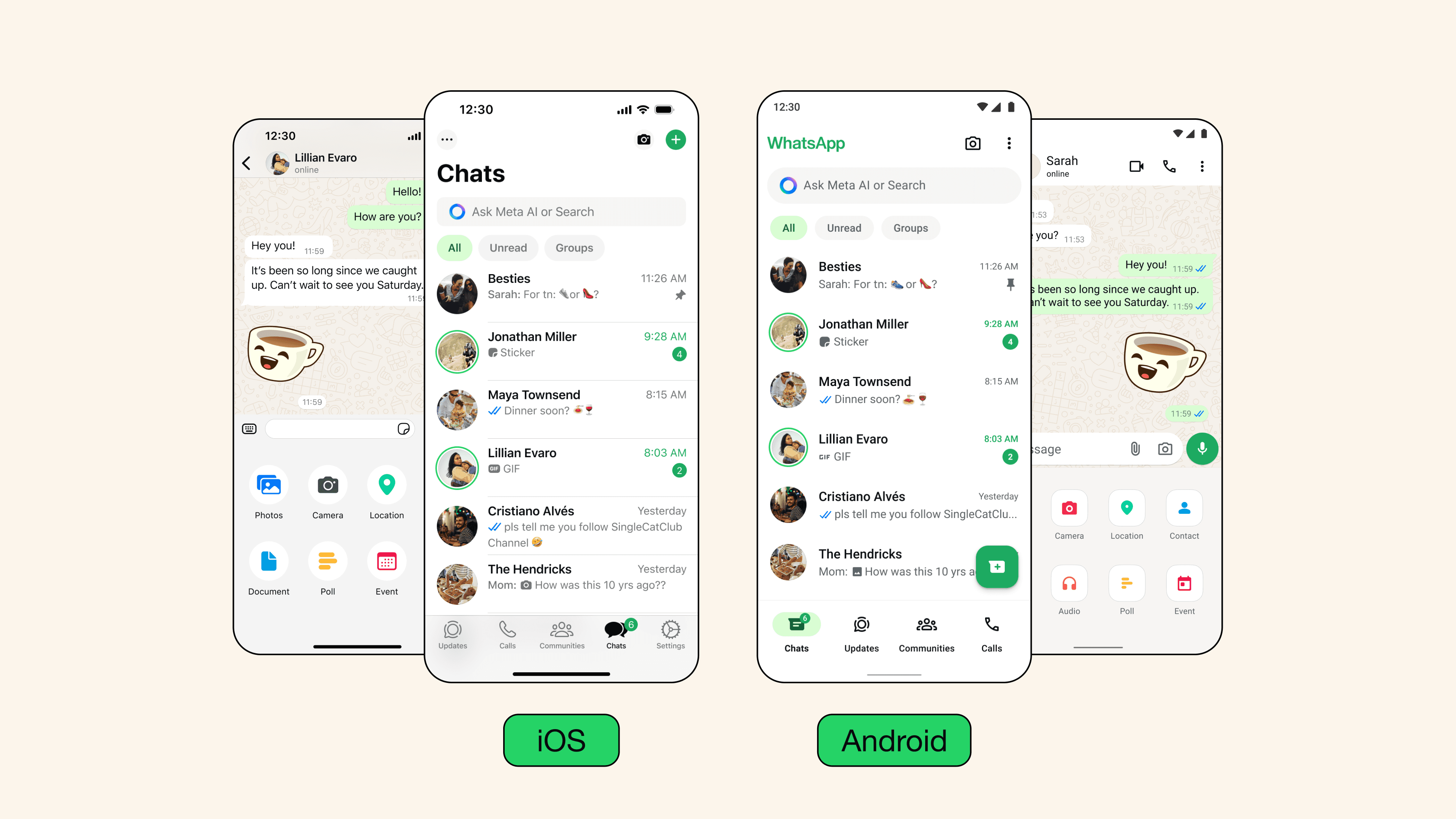
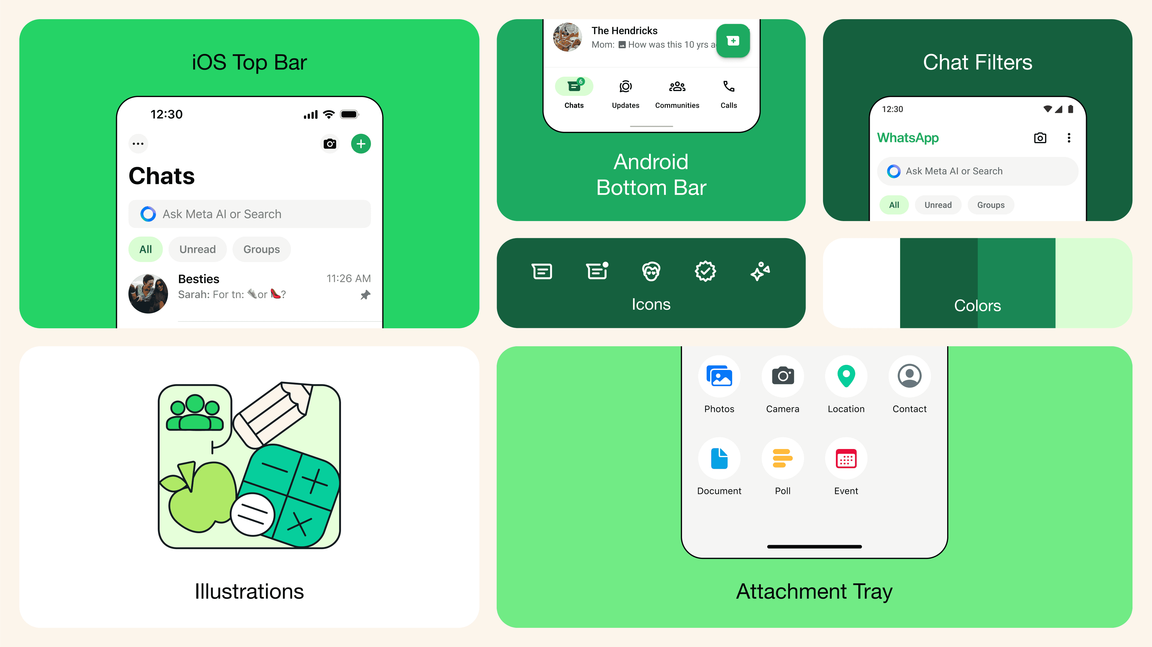
On Android, we’ve moved the main tabs to a new bottom navigation bar — one that aligns with the platform’s native patterns and places the most-used sections closer to your thumb for quicker access.

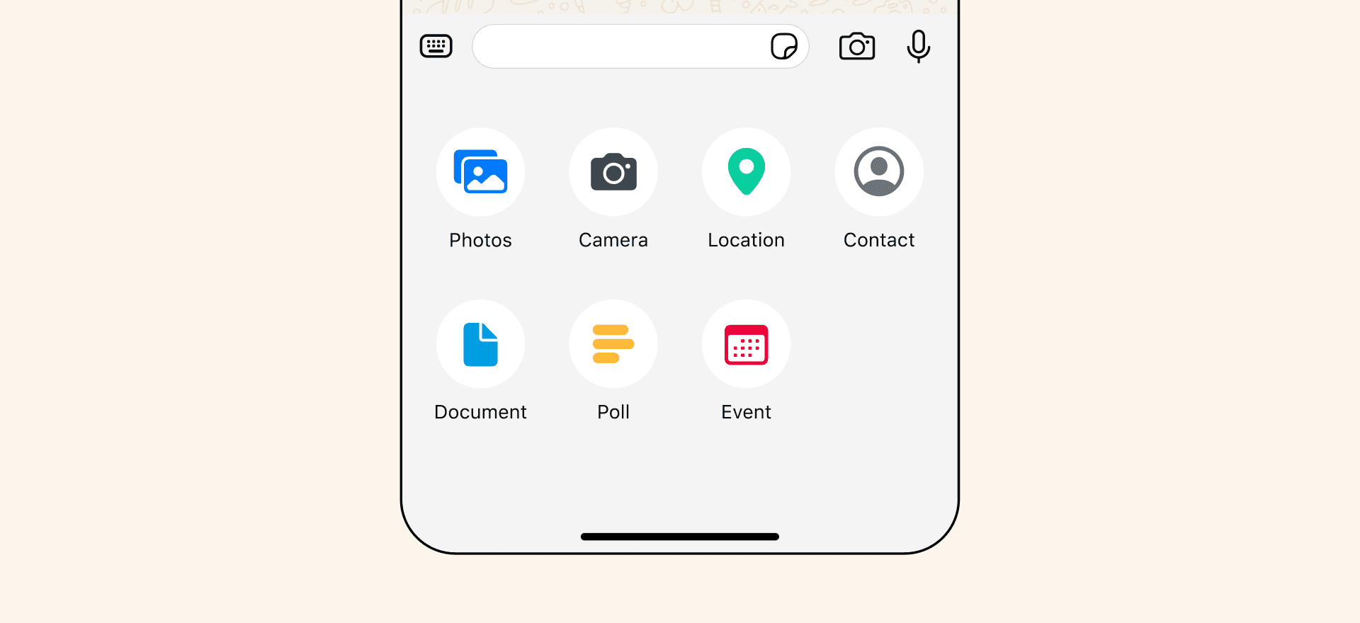
Meanwhile on iOS, sending media and other attachments has been made more intuitive with a redesigned expandable tray. Instead of opening into a full-screen menu, the new layout gives a clearer view of available options like photos, documents, polls, and more.
Smarter tools for managing conversations
Many people have asked for better ways to organize their messages. In response, we introduced chat filters — making it easier to find the conversations you care about without digging through your entire inbox. By relocating the Android nav bar to the bottom, we created space to place filters at the top, letting you quickly jump between unread messages or your group chats with one tap.

What’s next
This update reflects a huge collaborative effort from teams across design, research, and engineering. WhatsApp is used in countless ways every day — for staying close to family, teaming up on work projects, chatting with businesses, or engaging with Meta AI — and we’re continuously designing to support all of it.
This will hide itself!
A closer look at the thinking behind our redesigned experience on WhatsApp Every day, WhatsApp plays a vital role in how over 2 billion people connect. With that kind of reach comes real responsibility — and we don’t take that lightly. We obsess over the little things, aiming to deliver a product that not only functions effortlessly but also feels like a natural extension of your device. The goal? To help you stay present in the conversations that truly matter. When our design supports more meaningful communication and unlocks new ways to connect, we know we’re doing something right. Our design approach is rooted in WhatsApp’s core values: simplicity, dependability, and privacy. We interpret these principles through a design lens, crafting clear, intuitive experiences that are universally accessible. Every flow is built with intention — to make connecting feel easy while safeguarding your privacy. We’re thoughtful about how people already use their phones and shape the interface to align with those patterns, so WhatsApp feels familiar from the first tap. If you’re comfortable using your phone, you’ll feel right at home here.
YEAR
2024
ROLE
Lead Product Designer
SERVICES
Product Design
Design systems
Illustrations
Motion
About the project
Reimagining the App Experience
The way we approach change at WhatsApp is deliberate — it’s rooted in empathy, and always considers the human impact first. Every design decision is made with care, taking into account varying internet speeds, levels of digital fluency, and how people build habits through repetition. We’re thoughtful about preserving what’s familiar, so updates feel smooth and purposeful rather than disruptive.
In the past, much of our focus has been on increasing functionality. As WhatsApp’s capabilities expanded, we recognized the need for the visual design to evolve alongside it. Our goal was to modernize the interface — keeping the core feel intact, while introducing a cleaner, more updated aesthetic.
Design foundations that guided our work
To navigate the many rounds of exploration, iteration, and discussion, our team anchored on three core principles:
Fresh: WhatsApp should feel modern, fun, and personally yours — while maintaining a design that’s native to the device you use.
Approachable: Using WhatsApp should feel natural and welcoming. The interface should blend seamlessly with your OS while retaining that familiar WhatsApp personality — casual, friendly, a little bit playful.
Simple: Any updates to design should reinforce clarity, work at scale, and support future product growth.
A refreshed color system
We introduced a more cohesive green palette that brings consistency throughout the app. After exploring over 35 options, we refined a collection of hues that stay true to WhatsApp’s signature green while providing better harmony across different surfaces. Alongside that, we expanded the use of neutral tones, allowing us to highlight key elements with green more intentionally.
We also responded to requests for a deeper dark mode. The updated version features a darker shade with increased contrast — making it more comfortable to view in dim lighting and easier to read.
Updated visuals and playful animation
Visual cues like icons help guide people quickly through actions and information, so we focused on making them more intuitive. Our icons now feature rounded outlines for a cleaner, friendlier look. We also updated our illustration style to match — with new animations that add warmth and a touch of playfulness to the experience.
We took this opportunity to revisit the default chat background, too. The doodle was beloved by many, but we saw a chance to make it feel more connected to real conversations. We re-evaluated every element in the illustration and introduced a new set of simple, inclusive visuals that reflect a broader range of people and everyday symbols.
Navigation that’s easier to reach
On Android, we’ve moved the main tabs to a new bottom navigation bar — one that aligns with the platform’s native patterns and places the most-used sections closer to your thumb for quicker access.
Meanwhile on iOS, sending media and other attachments has been made more intuitive with a redesigned expandable tray. Instead of opening into a full-screen menu, the new layout gives a clearer view of available options like photos, documents, polls, and more.
Smarter tools for managing conversations
Many people have asked for better ways to organize their messages. In response, we introduced chat filters — making it easier to find the conversations you care about without digging through your entire inbox. By relocating the Android nav bar to the bottom, we created space to place filters at the top, letting you quickly jump between unread messages or your group chats with one tap.
What’s next
This update reflects a huge collaborative effort from teams across design, research, and engineering. WhatsApp is used in countless ways every day — for staying close to family, teaming up on work projects, chatting with businesses, or engaging with Meta AI — and we’re continuously designing to support all of it.
This will hide itself!